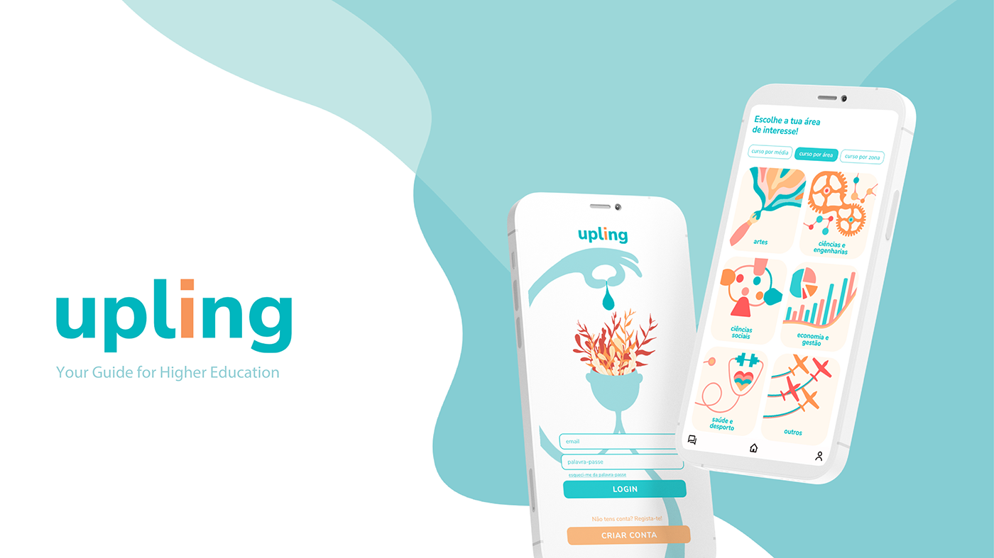
Case Study - Upling
by Pedro Botica

Upling was created during my bachelors for a graphic/interaction design course.
It’s goal is to help people level up their skills and get the right education for them. Although its main focus in on helping guiding high school seniors into the path that’s best for them, be that higher education or going straight to the job market, it can also be used by students already in college or professionals looking to learn new skills.
User Research
To create something that helps someone, you first need to know them. This is where our user research came in. We wanted to understand what these students struggled with and what they wanted from our service, or if they even wanted anything at all.
To do this we interviewed some students each of us knew and looked to sum up those insights into a persona that would represent the target audience of our group. We also understood that not all students are the same, and don’t share the same goals or the same pains. Due to this we ended creating 3 different personas that would represent different audiences for our app.


Market Research
One of the advantages of working with a topic that already has many solutions in the market is that there’s a lot of resources to learn from. It’s possible to see what already exists, what people like and dislike about it. A lot of ground has already been covered and there’s no need to reinvent the wheel.
We gathered information about competitors, identified what each did well and arrived at a central issue:
This is not fun
Now, finishing high school and figuring out what to do after is not something we tipically think of as fun. It’s actually quite stressful, and having a website that looks like this certainly doesn’t ease any anxiety.
But maybe that’s not a fair comparison. After all this website mostly works as way for people to interact with a database, it’s not trying to motivate you. But the navigation was also very weird, this page, the default one, has you searching for courses by the first letter in their name.
Another example is “Inspiring Future”, a website that looks to do pretty much the same thing as Upling. You can tell by the name. This website had some issues like navigation not being intituitive (the call-to-action is a search bar that doesn’t work very well), and it’s overly serious tone. Outside of this the website had a lot of useful information: the courses that are available and where, the grades you need to get in. But some was also missing, i.e in some course the course plans would direct you to another website that had them.
”Design the future” was another competitor that had an interesting feature that we liked: a quiz that would match you with some professions. This was also the first item in their page, and served well as a call to action. However it’s presentation was also very confusing.
Conclusions
The navigation for these platforms is all over the place, adding stress to an already stressful environment. They are very serious in their presentation and language, not making the students that visit them at ease.
Designing
We had a pretty good idea of how we wanted Upling to feel like. We wanted it to be fun and easy going so students who used it would feel relaxed about their future, with all the information easily readable and accessible, but we didn’t want to present it all once as that can be very overwhelming.
Features
With this in mind we proceeded to design the navigational structure of the app and where everything would be found
